
The Challenge
Though the products spoke for themselves, Alder & Co’s visual identity felt outdated and inconsistent. The logo lacked warmth, the packaging was generic, and their online presence didn’t reflect the care put into each item. They needed a brand system that felt both elevated and grounded — premium, but personal.
The Solution
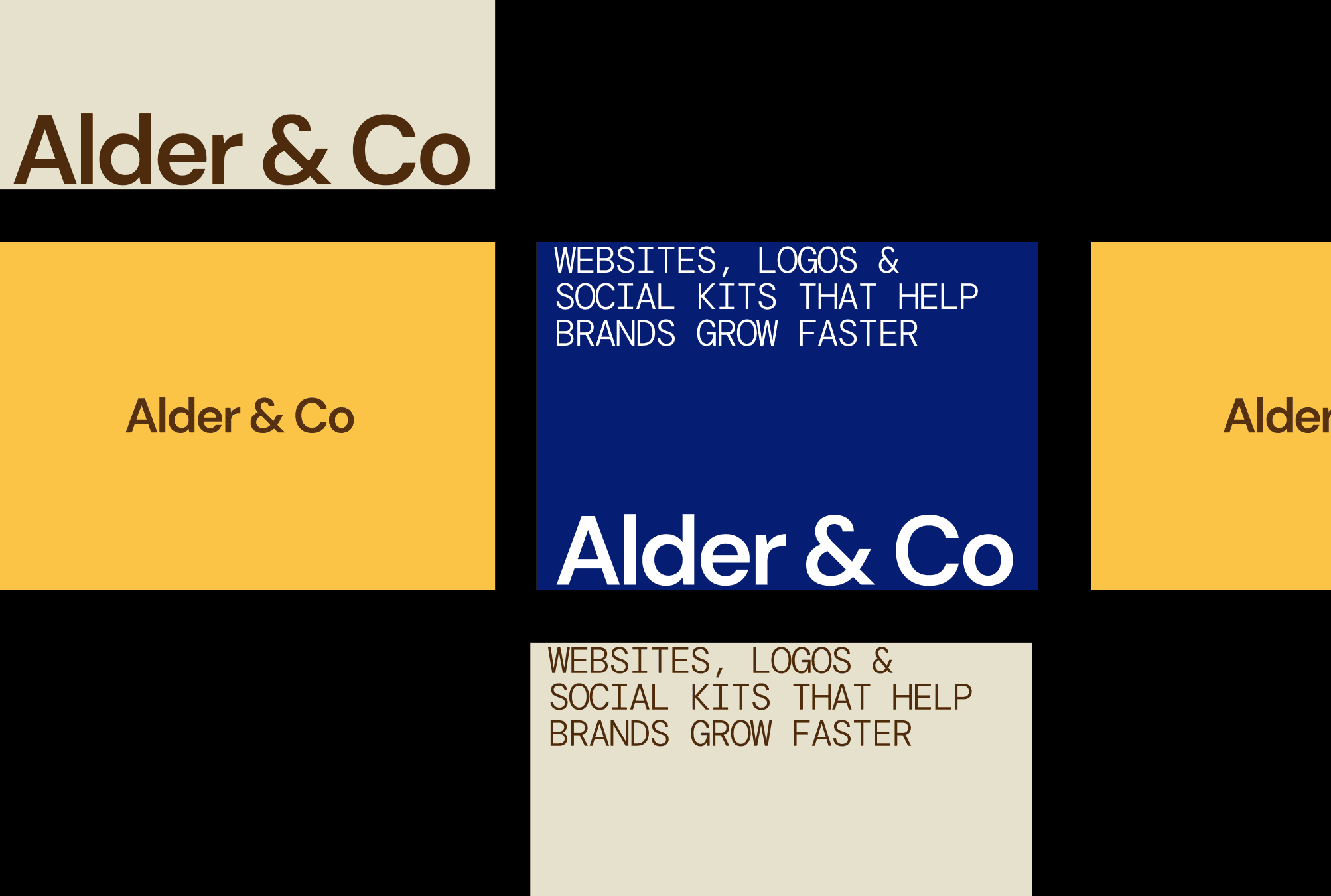
We designed a refined brand identity built around natural textures, soft typography, and flexible layouts. The new logo features a custom serif logotype with subtle imperfections, adding warmth and character.
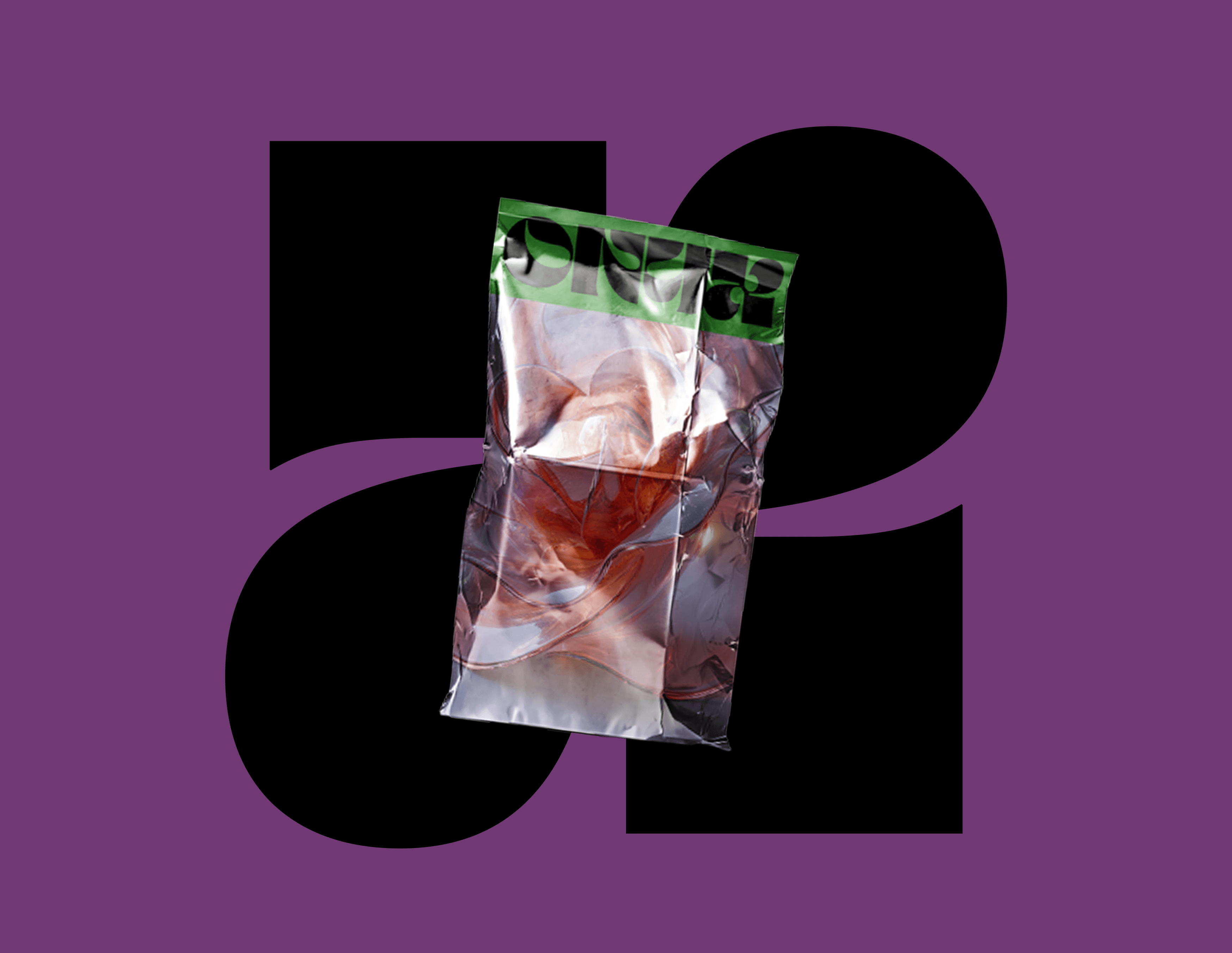
We developed a neutral, earthy color palette and introduced soft photography direction to showcase materials and craft. Packaging was simplified, using recycled materials with letterpress-inspired labeling.
The Shopify storefront was redesigned to feel editorial and calm, mirroring the in-store experience.


Outcome
Alder & Co’s rebrand helped reposition them as a conscious premium label. Sales increased after the launch of the new site and packaging, and the updated visuals were featured in several design publications. Most importantly, the brand now feels like an extension of their values.