
The challenge
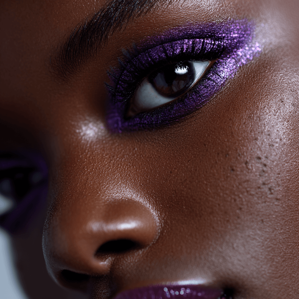
The market was saturated with either ultra-clinical or hyper-feminine skincare branding. Onyx needed to cut through the noise with a modern, minimal aesthetic that felt premium — but still expressive.
The solution
We developed a high-contrast visual identity focused on confidence through simplicity:
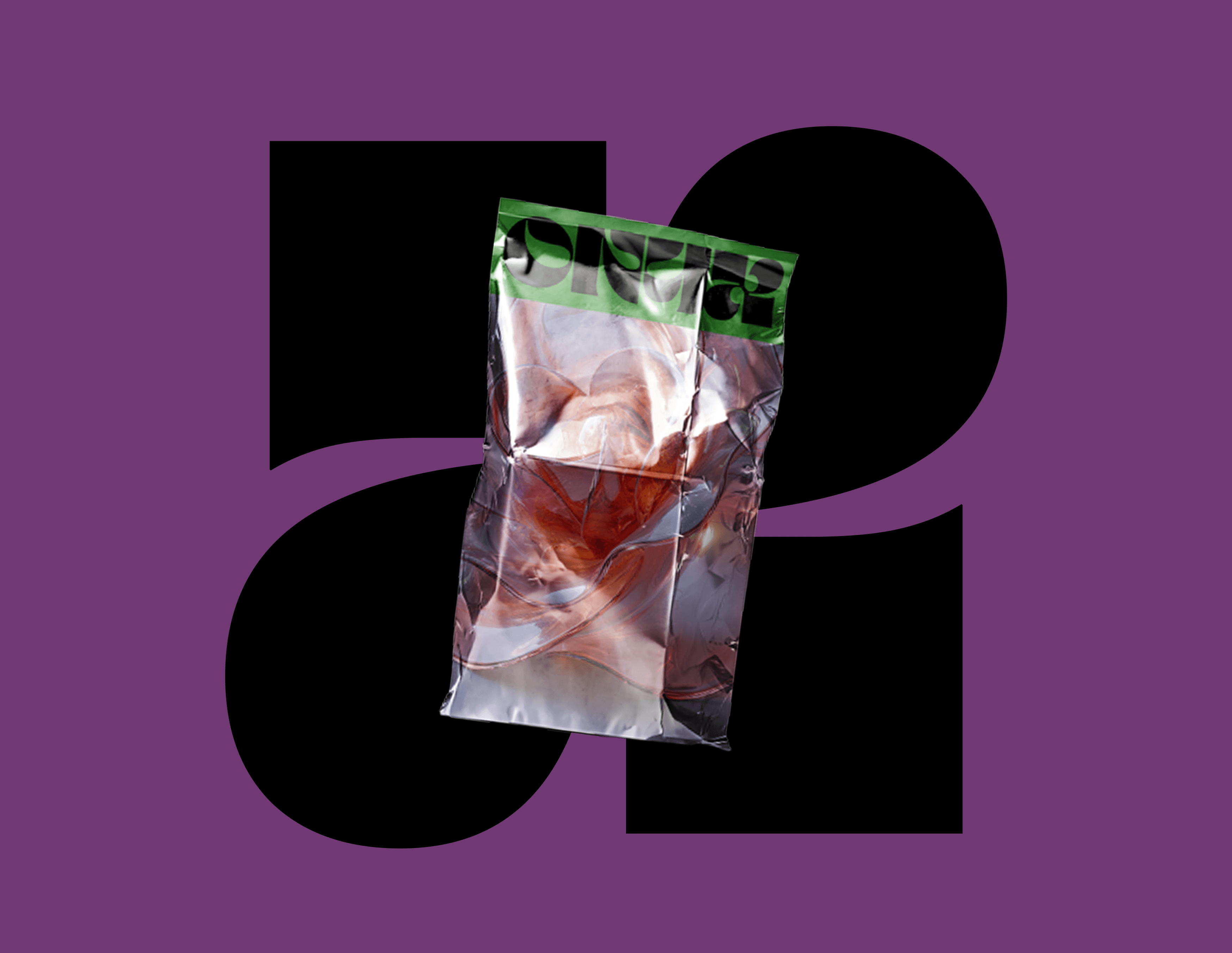
Brand Identity
Custom wordmark (ONYX) using strong, round-letter typography;
Color palette with deep berry red, warm neutrals, and white space;
Secondary type system that feels editorial and direct.


Outcome
The identity gave Onyx a launch-ready look in under 3 weeks.
Early feedback included:
2,000+ signups in the pre-launch waitlist
6.8% landing page conversion
70% of purchases included more than 1 product
Instagram saved posts increased by 3.2x during launch week.