
The Challenge
Though Fieldtype had an impressive track record, their brand lacked cohesion. The website was minimal but too bare, and the identity didn’t reflect their structured, detail-driven approach to design. They needed a visual system that felt precise, calm, and quietly confident.
The Solution
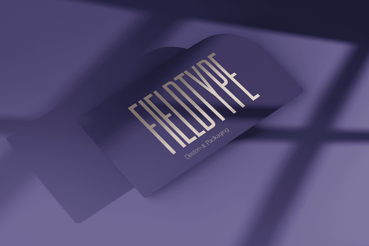
We developed a brand language rooted in grids, spacing, and clarity. The logo is built with monospaced rhythm and modularity in mind. The color palette blends soft neutrals with deep slate and cobalt accents — reflecting both logic and focus.
The site was designed to feel like a product in itself: smooth scroll, live demos, and documentation-style layouts. Subtle motion helps convey Fieldtype’s process-first mentality, without overwhelming the content.


Outcome
With the new brand in place, Fieldtype launched a fully redesigned site and case study library. The refreshed system has helped the team attract higher-tier projects, collaborate with tech startups across Europe, and scale their visual storytelling with ease.