
The Challenge
Nova was growing fast, but their visual identity didn’t reflect their energy or precision. Their site felt generic, their logo lacked edge, and none of their materials stood out in a competitive, high-velocity space. They needed a bolder system that spoke to both tech founders and high-caliber candidates.
The Solution
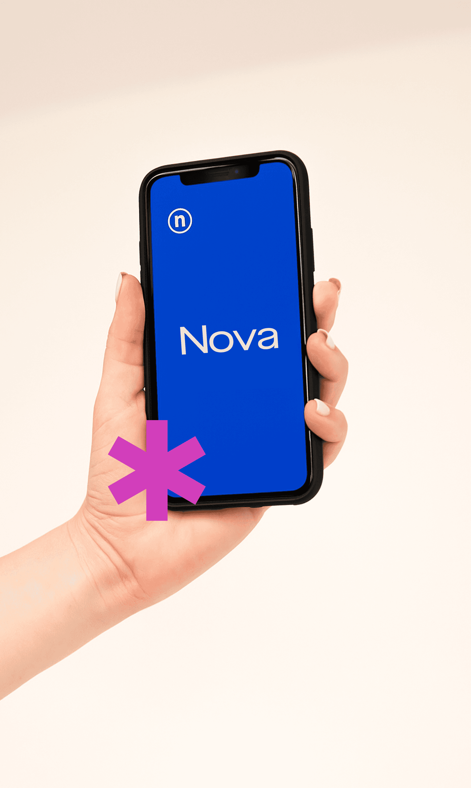
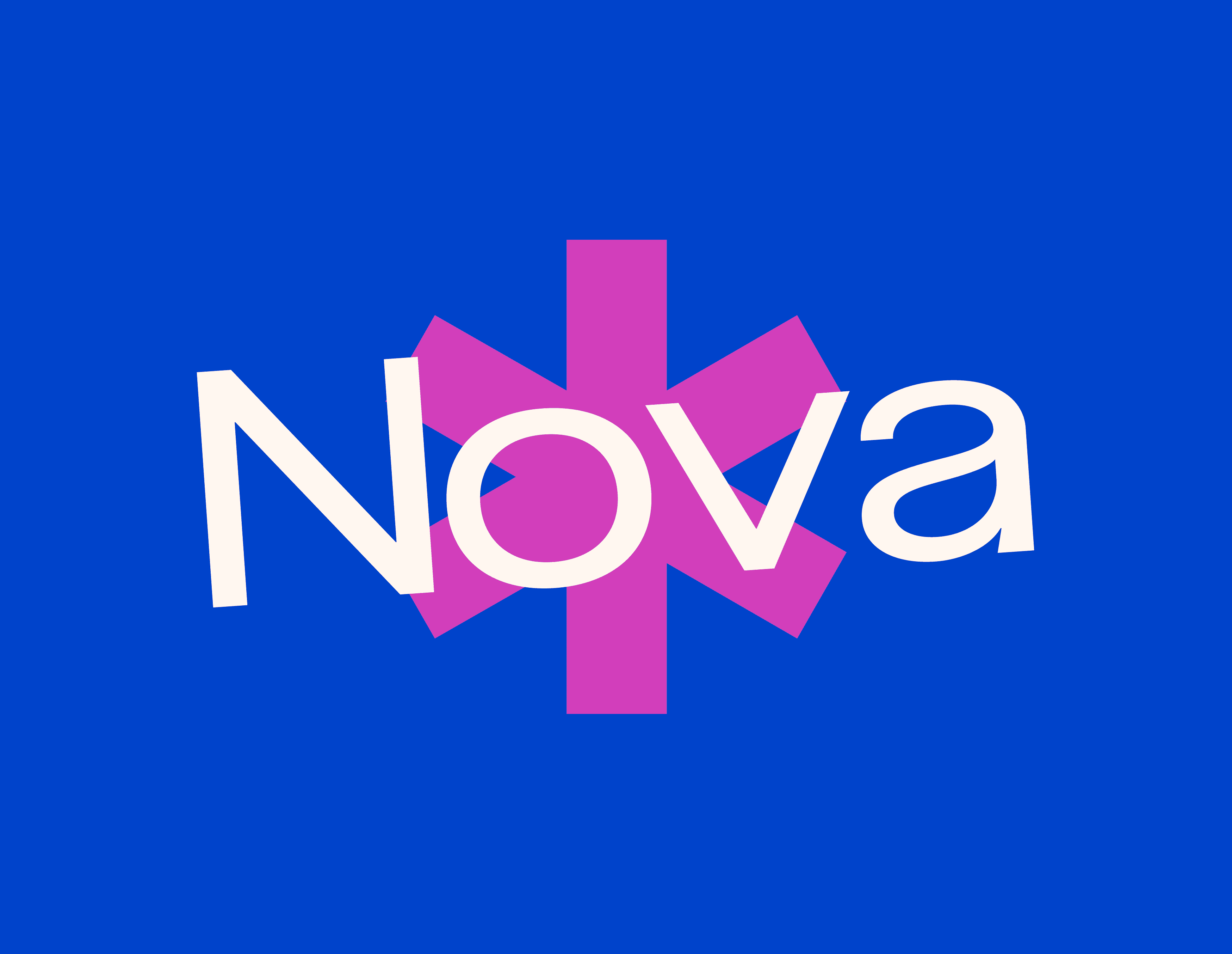
We built a brand rooted in clarity and speed. The wordmark was reworked for sharpness, and the new color palette blends dark neutrals with electric accents — a nod to Nova’s name and pace.
Typography leans modern and tech-forward, with consistent grid use across formats. We also redesigned the website with crisp, frictionless flows for two audiences: founders and candidates.
Motion and microinteractions were added to key sections, making the digital experience feel light and responsive.


Outcome
Nova’s rebrand helped position them as a serious player in the tech hiring space. The new system boosted conversion across founder demos and candidate sign-ups — and gave their team the tools to communicate with speed and clarity.