
The Challenge
Kairo was growing quickly but lacked a clear visual identity. Their product was expressive — but their brand felt generic. They needed a refresh that would reflect their creative audience while staying functional and scalable across use cases.
The Solution
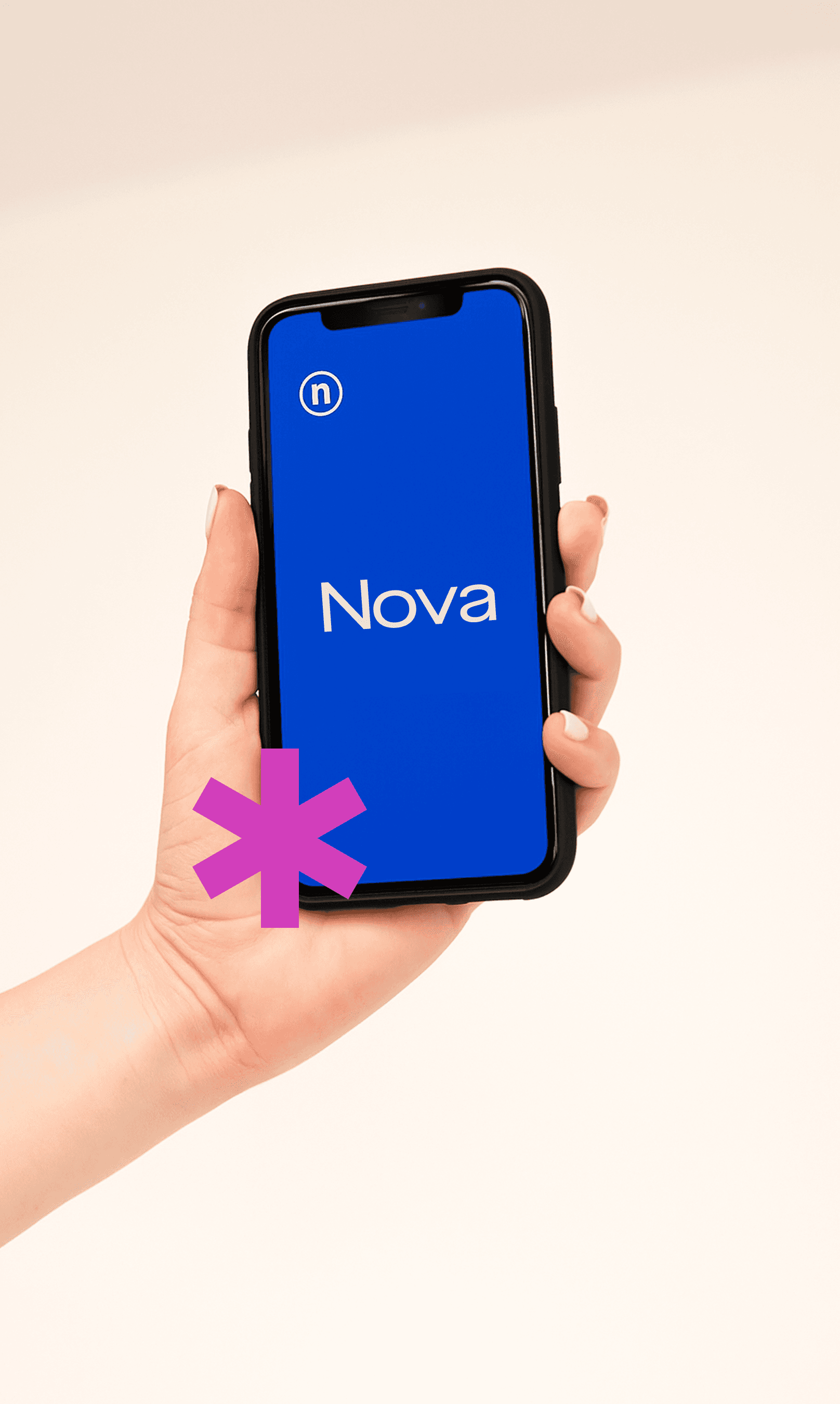
I developed a bold, modular brand system with a focus on clarity, rhythm, and movement. The new logo uses a custom wordmark with wide spacing and confident balance. The color palette is limited but expressive, working well across dark and light modes.
We also created a flexible slide system — used across internal decks, onboarding, and investor presentations — with layout styles that balance personality and precision.


Outcome
The new identity helped align Kairo’s brand with its product: creative, structured, and fast-moving.
Their team now uses the system across product marketing, investor decks, and onboarding flows — with fewer decisions and stronger consistency.